


Background images are really one of the many concepts to know about when working with images in CSS. They play a pivotal role in giving an aesthetic look to the design of your website if applied and placed properly. Whether it’s a personal blog (like mine), an e-commerce site, or just a landing page. Background images change the way site visitors perceive your brand or product. In this comprehensive guide, I will dive deep into working background images including how you can use them to further enhance the look and feel of your website.
Table of Contents
Prerequisites
To get started with background images, you will need:
- a basic understanding of HTML and CSS
- a code editor (Visual Studio Code, Notepad++, Atom, etc.)
- a browser like MS Edge, Chrome, or Firefox
- a passion to learn
Choosing the right image
Now, before moving straight to the syntax, one must wonder what are the characteristics of a good image. Well, it has to obey several characteristics such as image quality, relevance, and file size.
Image quality
The phrase “Quality over quantity” by Seneca (8BC – 68AD) is true in many ways. A quality image is one that is clear in terms of its resolution. Having a low-quality or pixelated image can cause more bad than good for your website’s overall look. There are several popular stock image sites such as Pexels, Pixabay, and Unsplash that provide high-quality images for you to download for free and use. The most they might ask is to provide attributions to the original author of the image, which, you can achieve by simply putting a caption or alt attribute to your background image.
Relevance
Choosing the right image for your website is actually a demanding task from my perspective. There are countless times when I have tried searching for an image that represents the picture in my head but still failed nonetheless. Sometimes, it is best to take a look at your blog and target audience in order to analyze and decide what might be the most suitable image that is relevant to the content that you’re writing about. For example, if you’re running a travel blog, using images of scenic destinations from popular stock photo sites or from your own image gallery is more apt.
File Size
In web development, file size plays a big role in optimizing page speed and search engine optimization (SEO). This is generally because reduced file size means faster loading times which relates to better SEO and higher rankings on Google. To reduce file sizes, Google recommends ensuring to compress and resize the images in addition to converting them to WebP image extensions. Furthermore, using vector-based images (SVG) for icons is more resource-efficient than raster-based images. There are several tools that you can use to compress images like Tiny PNG and Compress Now.
Background image properties
To create a background image, you need to know the properties of the image as well. These include:
background-image
The background-image property is used to specify the image URL that will be used as the background.
background-image: url('path/to/file');Code language: CSS (css)Values:
- URL of image: the image URL that you want to display
- linear-gradient: a function that takes comma-separated values starting with angle and then colors
- radial-gradient: another function that takes comma-separated values starting with the shape and then colors
background-repeat
It controls how the background image is displayed in the background.
background-repeat: no-repeat;Code language: CSS (css)Values:
- repeat: The image is repeated on the x and y-axis
- no-repeat: image is not repeated
- repeat-x: The image is repeated on the x-axis.
- repeat-y: The image is repeated on the y-axis.
- space: images are pinned to the edge of the element leaving whitespace in the middle
- round: the images are repeated and stretched if there is no available space
- combination of the two values above
Default: repeat
background-size
This defines the size of the element’s viewport whether it follows its size or is stretched to fill the available space.
background-size: 400px;Code language: CSS (css)Values:
- contain: the image is contained in the integer according to its original size
- cover: scales the image so that it fills the container fully
- integer: any value that specifies the width and height of the image
- auto: default scaling
Default: auto auto
background-position
Specifies the values for positioning the background image in the element and is relative to the background-origin property.
background-position: top center;Code language: CSS (css)Values:
- top
- bottom
- left
- right
- center
- integer: values that specify the x/y coordinate
- combination of two, three, or four keyword values
Default: 0% 0%
background-attachment
Sets whether the position of the image is fixed in its place or scrolls together with the text.
background-attachment: scroll;Code language: CSS (css)Values:
- scroll: the element scrolls with the background
- fixed: the element does not scroll with the background
- local: the background scrolls with the element’s contents
Default: scroll
The CodePen below shows background-attachment in action.
background-origin
Is related to the box-sizing property, where the image is placed relative to the border around it.
background-origin: padding-box;Code language: CSS (css)Values:
- border-box: the background is positioned respective to the border-box
- padding-box: the background is positioned respective to the padding-box
- content-box: the background is positioned respective to the content-box
Default: padding-box
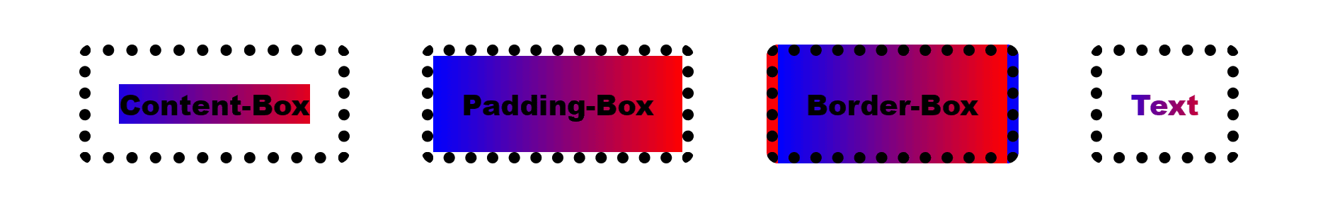
background-clip
Sets whether the background is clipped to the element.
background-clip: border-box;Code language: CSS (css)Values:
- border-box
- padding-box
- content-box
- text
Default: border-box
The differences between each value are shown below.
background-blend-mode
Sets whether the position of the image is fixed in its place or scrolls together with the text.
background-blend-mode: screen;Code language: CSS (css)Values:
- normal
- multiply
- hard-light
- soft-light
- difference
- darken
- luminosity
- screen
- lighten
- overlay
- color-dodge
- color-burn
- exclusion
- hue
- saturation
- color
Default: normal
You can try out different blend modes here at MDN playground.
Multiple background images
Have you ever tried to create a pattern design in CSS but found it hard? Well, good news, you can actually implement these patterns using multiple background images with the background-image and background-repeat properties which you can then implement onto any project to enhance the designs.
It is really easy to achieve this by simply using multiple URL values separated by commas with each image being layered on top of each other with the first one being on top and the last one being at the bottom. The Codepen below shows how 3 images are being stacked and layered together in order to form a background image.
If you noticed above, I wrote many lines of CSS but there’s actually a shorthand to writing it as demonstrated below.
.bg-image {
	height: 100vh;
	width: 100%;
	background: url("<https://images.pexels.com/photos/5514709/pexels-photo-5514709.jpeg>")
			no-repeat bottom left,
		url("<https://images.pexels.com/photos/4049441/pexels-photo-4049441.jpeg>")
			no-repeat center,
		linear-gradient(to right, #ffdf00, red) no-repeat left top;
	background-size: 300px, contain, cover;
}
Code language: CSS (css)
Note: remember to change the background image to the background for it to work
Multiple background images are a really good effect that opens up a world of possibilities that you can imagine and incorporate into your personal or client’s projects.
Gradients as backgrounds
If you were paying attention to the previous topic, I added a gradient to the background image using the linear-gradient() and radial-gradient() functions. This is a common use case for background images where the developer may want to use gradients for background images as opposed to an original image. This type of design is usually applied to various scenarios including button styles, modern hero sections, progress bars, and so forth.
Linear-gradient
As the name suggests, linear gradients create smooth colors along a straight line. You can control the direction of the line by specifying the angles (90deg, 180deg) or keywords like to top, to right, to bottom, or to left. This is followed by inserting the colors that represent each part of the gradient (you can add as many colors as you like).
.cta-btn {
	background: linear-gradient(90deg, #ff00dd, #f8db06);
}Code language: CSS (css)
Radial-gradient
This type of function is a circular gradient that starts from an origin. The syntax of this function is the same as the linear-gradient but instead of the angle, you have to specify the shape of the gradient, whether its ellipsis or circle .
.cta-btn {
	background: radial-gradient(circle, #ff00dd, #f8db06);
}Code language: CSS (css)
By learning how to use gradients, you can create various types of designs for a more appealing and aesthetic look on your website. For example, the above image is a simple hero section that I created just to show you how gradients can be used in action. In addition, you can use a tool like CSS Gradient Generator to visualize the type of gradient you’re going through so you can generate the code to use it. Bear in mind that it is important to practice and understand the syntax first before using this tool.
Responsive background images
Responsive design has always, and will always, be a crucial aspect of web development as users who visit your website use various types of devices from desktops to tablets and smartphones. Ensuring that your website adheres to different screen sizes will determine whether users stay on your site or bounce off.
Due to that, this section will showcase how you can create responsive background images using a combination of background-size property and media query in CSS.
/* Laptops, Desktops and larger screens */
.bg-image {
	background-size: 800px;
}
/* Tablet screens*/
@media screen and (max-width: 768px) {
   .bg-image{
      background-size: 400px;
   }
}
/* Mobile screens*/
@media screen and (max-width: 480px) {
   .bg-image{
      background-size: 300px;
   }
}
Code language: CSS (css)
Note: In some cases, you might need to replace the image with a different one or a smaller version of the original for better user experiences.
Conclusion
Ultimately, working with background images may seem hard at first but trial and error will be your best bet if you want to learn anything related to programming. Using the knowledge from the above topics, I would suggest starting out to try experimenting with different values for each property in background images. Then, add multiple background images to make the website more visually appealing as well as add a gradient to further spice up the image. Don’t forget to ensure responsiveness too.
Feel free to leave a comment down below and let me know which topic seemed the most interesting to you. Now, go get some backgrounds populated with images!